
Open-source accessibility tool
A11y Smart Color Contrast Checker
An open-source web app and Figma plugin that checks WCAG contrast and suggests accessible colour alternatives.
Explore the project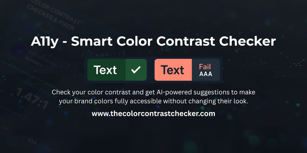
Project overview
What it does
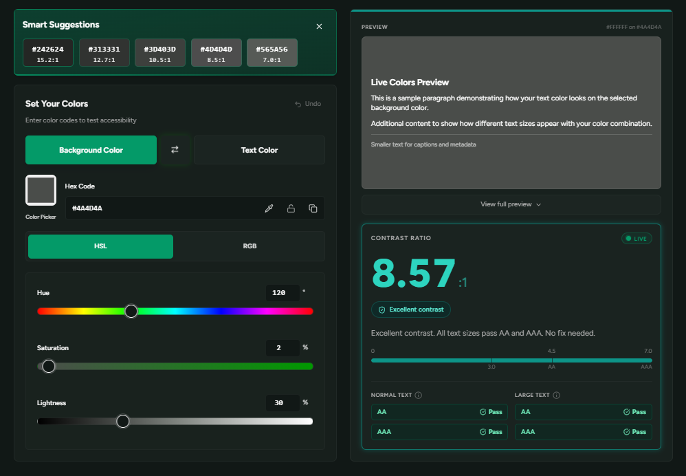
The tool checks text and background colour combinations against WCAG contrast thresholds and shows the live contrast result for both normal and large text.
When a colour combination needs improvement, the tool provides five smart colour suggestions. The suggestions are designed to remain visually close to the original colour while improving accessibility, helping designers work towards compliance without immediately abandoning the existing visual identity.
The designer still keeps control of the final result. A suggested colour can be applied directly, or the colour can be adjusted manually using the available controls while the contrast ratio and preview update in real time.
- Five smart accessible colour suggestions
- Live contrast ratio and WCAG AA and AAA status
- Separate checks for normal and large text
- Live colour preview
- Manual hue, saturation and lightness controls
- Direct application of suggested colours
The project is available as:
- A free web app
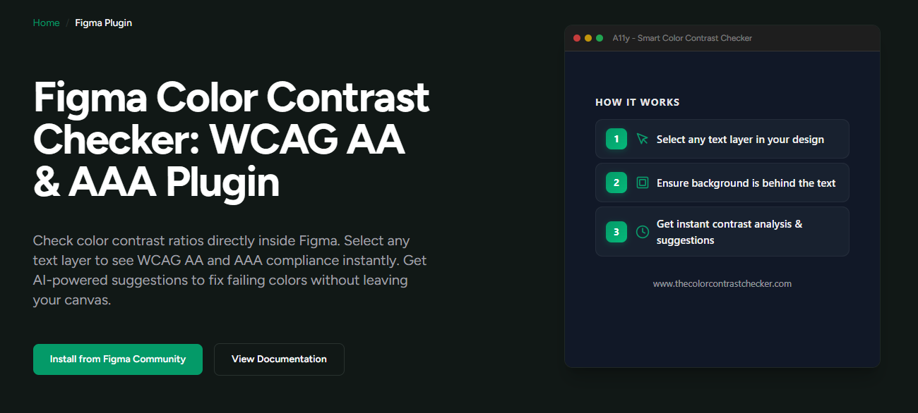
- A Figma Community plugin for checking contrast inside the design workflow
- An open-source GitHub repository
Accessibility without losing the visual identity
The idea behind the project is simple: accessibility should not force designers to abandon brand identity.
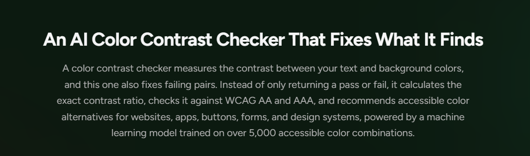
A colour can technically pass a contrast test and still feel completely disconnected from the rest of a product's visual language. I wanted the tool to do more than report a failure. I wanted it to help designers move towards an accessible result while keeping the suggested colour close to the one they originally intended to use.
That changes the role of the checker from a reporting tool into a problem-solving tool.
Why I built it
The project grew from my work in UI/UX design and digital accessibility. I kept seeing a practical gap between identifying an accessibility failure and giving designers a usable way to resolve it.
The research direction began in late 2024. I later developed the idea into a public web application in August 2025 and extended it into a Figma plugin in September 2025 so the accessibility workflow could sit closer to where designers already work.
For me, the important lesson was that a useful accessibility tool should not stop at saying "this fails". It should help the designer understand what can be changed and still leave them in control of the final design.
Where it stands today
By August 2026, the Figma plugin had reached more than 300 users. The project has also received independent recognition and use outside my own network.
- Accepted into the Awesome-A11y GitHub repository, where it is listed in the Colors and Contrast section
- Featured in Accessibility Weekly, Issue 499
- Included in the A11y News accessibility resources collection
- Used independently by UI/UX designer Juan Martín Rossi during an accessibility review of his own design work
- Reviewed twice by Louise Morrell, Senior Lecturer in Creative Design and User Experience at Southampton Solent University
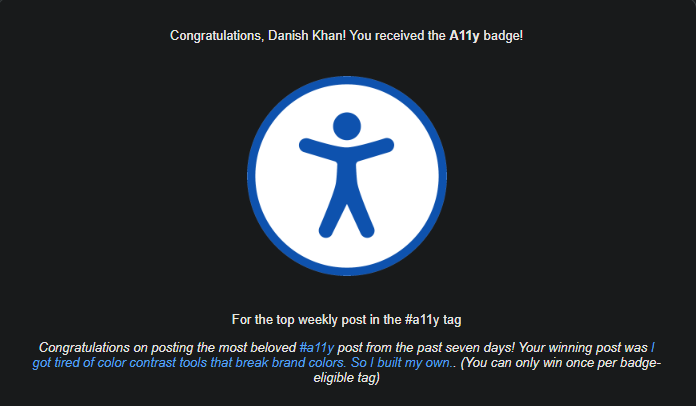
- A DEV Community article about the project became the top weekly post in the #a11y tag and received the platform's A11y badge
From research to a working product
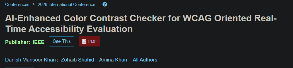
The idea behind the tool also became the basis of my peer-reviewed research, "AI-Enhanced Color Contrast Checker for WCAG Oriented Real-Time Accessibility Evaluation."
I presented the research remotely at ICAIII 2026, and it was later published in IEEE Xplore in May 2026.
For me, this connection between research and product development is important. The research helped formalise the accessibility problem, while the public tool gave me a way to turn that work into something designers could actually use.
Community recognition
I also shared the thinking behind the project with the wider developer and accessibility community.
My article about the tool became the top weekly post in the #a11y tag on DEV Community, which resulted in the platform issuing its A11y badge.
Try the project
If you design or build digital products, you can explore the project here:
- Web app: thecolorcontrastchecker.com
- Figma plugin: Figma Community Plugin
- GitHub: GitHub Repository
Feedback and contributions welcome.
Connected work
Explore the bigger picture.
Keep exploring
More ideas, made practical.
Explore the rest of my digital products and accessibility tools.